
Interior design trends 2026: what the fairs and colour reports mean for your specification
Salone del Mobile, Maison&Objet and the 2026 colours of the year, each sourced, and what they change for samples, approvals and lead times.
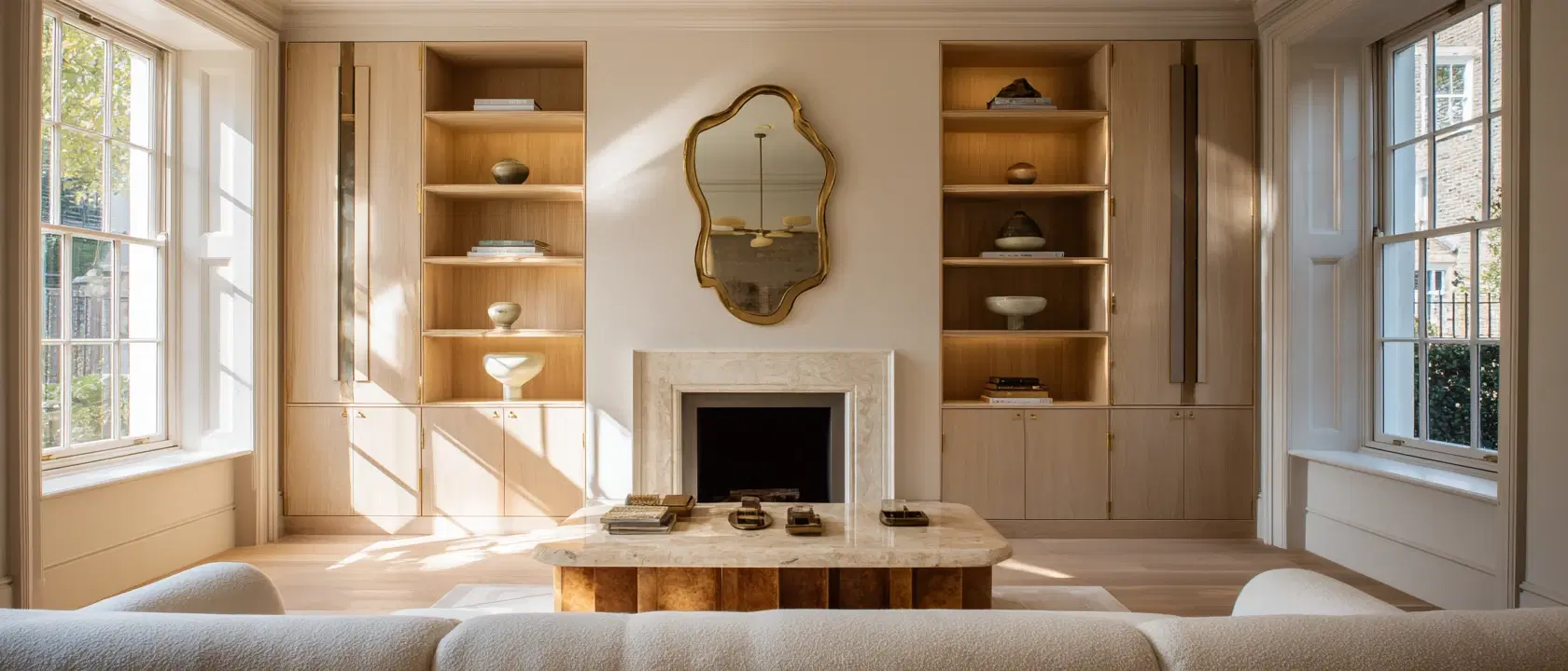
Trend reports are written to be read quickly and forgotten by the next fair. The useful part for a studio is narrower: which directions show up across several independent sources, and what they mean for the things you have to specify, approve and order. This is a 2026 reading of the major fairs and paint companies, with each claim tied to the report it came from, followed by what it changes on a real FF&E schedule.
One honest caveat first. A trade fair shows what manufacturers and curators chose to put on a stand; a paint company’s colour of the year is part research, part launch. Neither is a survey of what your clients will ask for. Treat them as signals to test in a brief, not instructions.
The sources this piece draws on
| Source | When | Headline |
|---|---|---|
| Maison&Objet Paris | 15–19 January 2026 | Theme: “Past Reveals Future”, with four directions: Metamorphosis, Mutation, Revisited Baroque and Neo-Folklore |
| Salone del Mobile.Milano (64th edition) | 21–26 April 2026, Fiera Milano Rho | Theme: “A Matter of Salone”, putting material at the centre; EuroCucina and the International Bathroom Exhibition ran alongside |
| Pantone | Colour of the Year 2026 | Cloud Dancer, PANTONE 11-4201, a white |
| Sherwin-Williams | Color of the Year 2026 | Universal Khaki, SW 6150, a mid-tone neutral with a slight yellow undertone |
| Dulux (AkzoNobel) | Colours of the Year 2026 | “Rhythm of Blues”: Mellow Flow, Slow Swing and Free Groove |
1. Material comes first, and it is allowed to show its making
The clearest single signal of the year came from Milan. The Salone’s 2026 theme, “A Matter of Salone”, framed material as the origin of design rather than the finish applied at the end. Blum’s trend report from the fair describes the same thing at product level: sustainable materials, stone such as travertine, wood textures, and machining marks and layers deliberately left exposed, paired with warm metal accents.
Paris pointed the same way from a different angle. FCI London’s review of Maison&Objet picked out clay and microcement for their raw, tactile qualities, alongside reclaimed wood furniture, recycled materials and biodegradable textiles.
What it means for specification. Honest, visibly made materials vary. Travertine varies by block, reclaimed timber by batch, hand-finished clay by the hand. That variation is the point for the client, and a risk for you. Write the approval around a physical sample, record which sample was approved, and say on the schedule that natural variation is accepted. If the client approves a photograph and the slab arrives with heavier veining, that conversation is much harder after the order than before it.
2. Craft, memory and the one-off piece
Maison&Objet’s “Past Reveals Future” theme looks back to look forward. Its four directions, as reported by Interior Daily, run from Metamorphosis (upcycling, where discarded materials are reimagined as new objects) through Mutation (traditional craftsmanship meeting contemporary materials) to Revisited Baroque (historical grandeur reworked through limited editions and collectible pieces) and Neo-Folklore (regional traditions refreshed with tools such as 3D printing).
Milan added weight to this with Salone Raritas, a newly curated section for collectible design, unique pieces and limited editions. Blum’s report lists hand-crafted furniture and sculptural seating as statement pieces under its “interior pieces” heading.
What it means for specification. One-off and limited-edition pieces are the slowest and least predictable items on a schedule. Lead times are often quoted loosely, there may be no like-for-like substitute if something goes wrong, and deposits tend to be larger. Put these items on the schedule first, get the maker’s lead time in writing, and work back from the install date to an order-by date before the client falls in love with the piece. Our guide to calculating order-by dates walks through that sum.
3. Colour: three directions that do not agree
The 2026 colours of the year are worth reading together precisely because they pull in different directions.
- Pantone, Cloud Dancer (11-4201). A white. For interiors, a quiet base rather than a statement.
- Sherwin-Williams, Universal Khaki (SW 6150). A mid-tone neutral with a slight yellow undertone, which the company presents as nature-inspired warmth chosen for livability and longevity.
- Dulux, Rhythm of Blues. For the first time Dulux named a colour family rather than a single shade: Mellow Flow (light), Slow Swing (dark) and Free Groove (vibrant). Dulux pairs them with suggested colour stories, including one that sets the blues against terracotta, brick and clay for residential and hospitality settings.
The fairs added warmth on top. Blum’s Salone report describes intensified earth tones (ochre, terracotta, apricot, warm chocolate) and dark surfaces. FCI London’s Maison&Objet review noted bold hues rather than neutrals: yellows from sunny to mustard, greens from emerald to sage, and blues from cobalt to teal.
Read across all of that and the common ground is not a colour. It is warmth and depth, layered on a calm base: whites and khakis as the envelope, earth tones and deep blues in upholstery, joinery and accents.
What it means for specification. Paint is the easy part; it can be changed late. Coloured upholstery, dyed leather, lacquered joinery and glazed tiles cannot. If a client is drawn to a saturated colour, get a physical swatch or strike-off approved early, note the dye lot on the order where the supplier offers it, and order enough fabric in one batch for every piece that must match.
4. Kitchens, bathrooms and furniture that hides things
EuroCucina and the International Bathroom Exhibition both ran as part of the 2026 Salone. Interior Daily reported EuroCucina focusing on intelligent, multisensory kitchens shaped by technology, sustainability and biophilic design, and the bathroom show developing the wellness idea, combining wellbeing with discreet digital integration.
Blum’s report adds a practical layer: multifunctional furniture and modular systems, concealed doors hiding storage and functional areas, and lighting treated as part of the furniture, with power-integrated pieces and layered indirect, accent and zone lighting.
What it means for specification. Integrated lighting and powered furniture move work from the decorator to the electrician. The furniture’s cable routes, driver positions and switching need to be on the electrical drawings before first fix, not discovered at install. These items carry two dates: the date the information must reach the contractor, and the date the piece itself must arrive. Track both.
5. Curves continue
Curved forms were not new in 2026, but they were still everywhere. FCI London’s Maison&Objet review describes sofas, chairs, tables and lighting embracing curved lines, with lighting in organic materials such as bamboo and hand-blown glass used as statement pieces.
What it means for specification. Curved upholstery and bespoke curved joinery are rarely stock items. Check access early: a curved sofa that cannot turn a stair or fit a lift is a problem you want to find on the survey, not on install day.
What all of this means for lead times
Put the five directions together and a pattern appears that matters more than any single colour. Much of what the fairs celebrated in 2026 (natural stone, hand-finished surfaces, one-off pieces, bespoke curves, integrated lighting) is made to order. Made-to-order work tends to bring:
- longer and less certain lead times than stock pieces
- approval of physical samples rather than images
- larger deposits, often before production starts
- overseas makers, so a supplier currency and import paperwork
- fewer easy substitutes if something slips
The practical response is to plan from the install date backwards. For every made-to-order line, record the install date, the supplier’s confirmed lead time, delivery time and a buffer, and work out the date the order must be placed. Then work back again to the date the client must approve. Our FF&E schedule template includes these columns, and managing supplier delays covers what to do when a maker’s date slips.
This is also where software earns its keep. In Techstyles every FF&E line is scored against its install date as blocked, at risk, watching or OK, with an order-by date counted back from the supplier’s lead time, so the bespoke travertine table shows up as at risk while there is still time to act. You can see how that works on the procurement page.
Using trends with clients without being led by them
A few habits help keep trend material useful rather than distracting.
- Use reports as vocabulary. Showing a client the Dulux blues or a Salone stand gives you a shared language for “warm”, “deep” or “handmade”. It does not replace asking how they live.
- Separate the envelope from the pieces. Paint and accessories can follow a trend cheaply. Big-ticket joinery, stone and upholstery should be chosen to outlast it.
- Put the lead-time conversation next to the mood board. When a client picks a one-off piece, tell them the order-by date and the approval-by date in the same meeting.
- Record decisions. Write down exactly which sample, finish and colour was approved, and when. Variation in natural and handmade materials makes that record more valuable, not less. Our guide to client approvals covers how to keep it.
The 2026 reports are, underneath, a case for slower and more considered work: materials with character, pieces made by hand, colour used with intent. That suits most studios. It just needs the schedule to be as considered as the design. If you want help with the second part, Techstyles offers a 30-day free trial with no card required.
Questions
- What are the interior design trends for 2026?
- Across Salone del Mobile and Maison&Objet 2026, the recurring directions were material-led design with visible making (stone, wood, clay, microcement), craft and one-off pieces, warm earth tones with bolder accents, multifunctional furniture with integrated lighting, and continued curved forms.
- What is the colour of the year 2026?
- It depends on the company. Pantone chose Cloud Dancer (11-4201), a white. Sherwin-Williams chose Universal Khaki (SW 6150), a mid-tone neutral. Dulux chose a family of three blues called Rhythm of Blues: Mellow Flow, Slow Swing and Free Groove.
- What was the theme of Salone del Mobile 2026?
- The 64th edition ran from 21 to 26 April 2026 at Fiera Milano Rho under the theme “A Matter of Salone”, which put material at the centre of design. EuroCucina and the International Bathroom Exhibition ran alongside it, and Salone Raritas launched as a curated section for collectible design.
- What was the Maison&Objet 2026 theme?
- Maison&Objet Paris ran from 15 to 19 January 2026 under the theme “Past Reveals Future”, with four trend directions: Metamorphosis, Mutation, Revisited Baroque and Neo-Folklore.
- How do 2026 trends affect lead times?
- Many of the 2026 directions, such as natural stone, hand-finished pieces, bespoke curves and integrated lighting, are made to order. That usually means longer lead times, physical sample approval and larger deposits, so order-by and approval-by dates need setting early.
Sources
- Pantone Color of the Year 2026: Cloud Dancer pantone.com
- Sherwin-Williams Color of the Year 2026: Universal Khaki sherwin-williams.com
- Dulux unveils the Rhythm Of Blues collection as its Colours Of The Year 2026 (Architects Datafile) architectsdatafile.co.uk
- Blum trend report: Salone del Mobile 2026 blum.com
- Salone del Mobile.Milano 2026 is all about matter, meaning and the future of design (Interior Daily) interiordaily.com
- Salone del Mobile.Milano official site salonemilano.it
- Maison&Objet unveils 2026 theme Past Reveals Future (Interior Daily) interiordaily.com
- Maison&Objet Paris 2026 review (FCI London) fcilondon.co.uk